Geozone dashboard
The geozone dashboard gives a high-level overview of the number and type of assets of each geozone or type of geozones. You have a live view, stock evolution and flows between geozones information here.
Geozone live view
The geozone dashboard provides a quick overview of all geozones, including the total number of assets currently inside or outside the geozone. You can filter on various geozone and attribute tags to drill down to a lower level.
The dashboard contains several widgets that display data based on the currently applied filters.
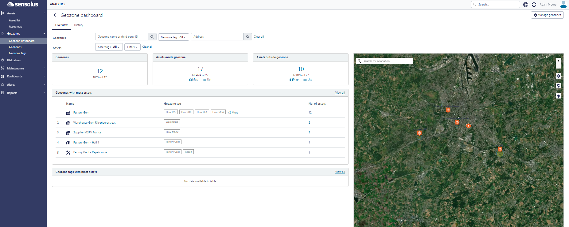
- Filter on geozone name or geozone tag to limit the results to a specific set of geozones.
- Filter on any type of asset attribute to limit the results to a specific set of
assets.Note: Add for example the filter ‘Battery percentage’ and put the setting on ‘less than 25%’ to know where the assets are that are equipped with a tracker with low battery percentage.
- Three numeric key indicators: Number of geozones (absolute and relative number), assets inside geozones (absolute and relative number) and assets outside geozones (absolute and relative number).
- Geozones with most assets: This table shows the top 5 geozones having the highest number of assets currently inside the geozone. Click on the name of the geozone to navigate to the individual geozone insights dashboard. Click on the total number of assets of a row to display a filtered list of the applicable assets.
- Geozones tags with most assets: This table shows the top 5 geozone tags having the highest number of assets currently inside the respective geozones. Click on the total number of assets of a row to display a filtered list of the applicable assets.
- Map view of the geozones: the map shows for every geozone an orange pin, the geozones are clustered if they are close by each other. The pin then contains the number of geozones it contains. By zooming into a cluster the different geozones will be visualized separately.
Stock evolution
The stock level view contains the following components:
- Filter controls to set time range and filter on assets.
- An animated visualization of the stock evolution over time
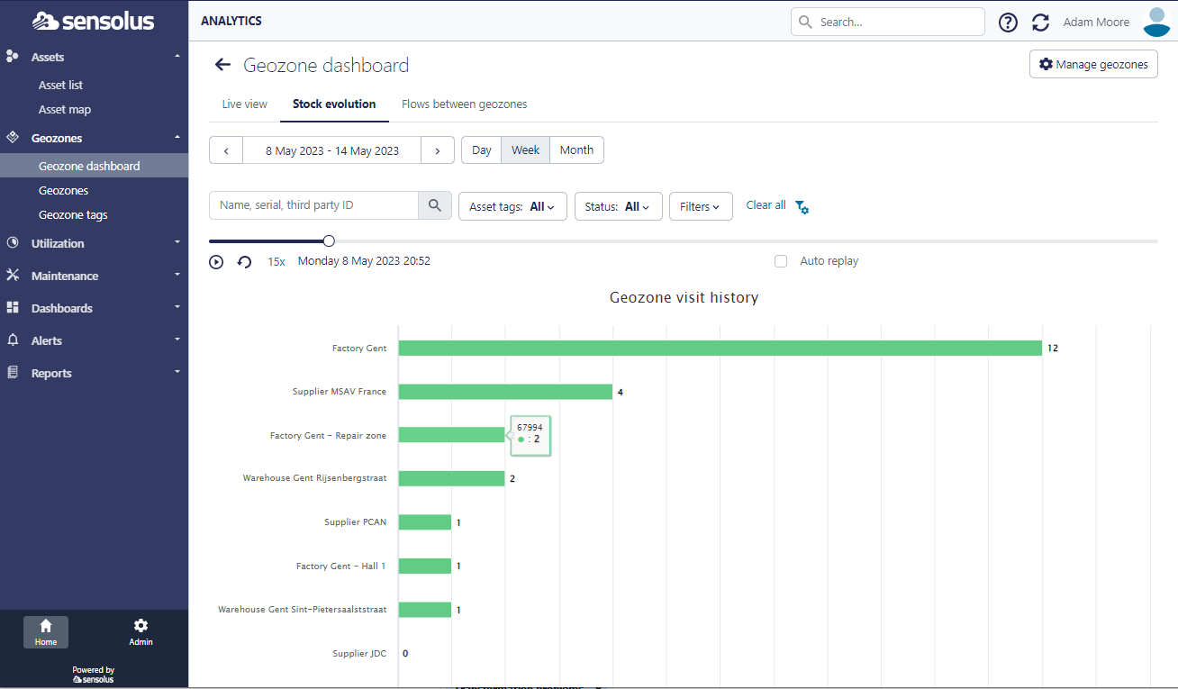
The evolution of the stock in the different geozones is shown over time in an animated
way. You start the application by clicking on the ![]() icon. You can replay the animation by clicking on the
icon. You can replay the animation by clicking on the ![]() icon. You can also select the speed of
the animation by clicking on the 5x . Finally, you can also select to auto reply
button to keep the animation running.
icon. You can also select the speed of
the animation by clicking on the 5x . Finally, you can also select to auto reply
button to keep the animation running.
Flows between geozones
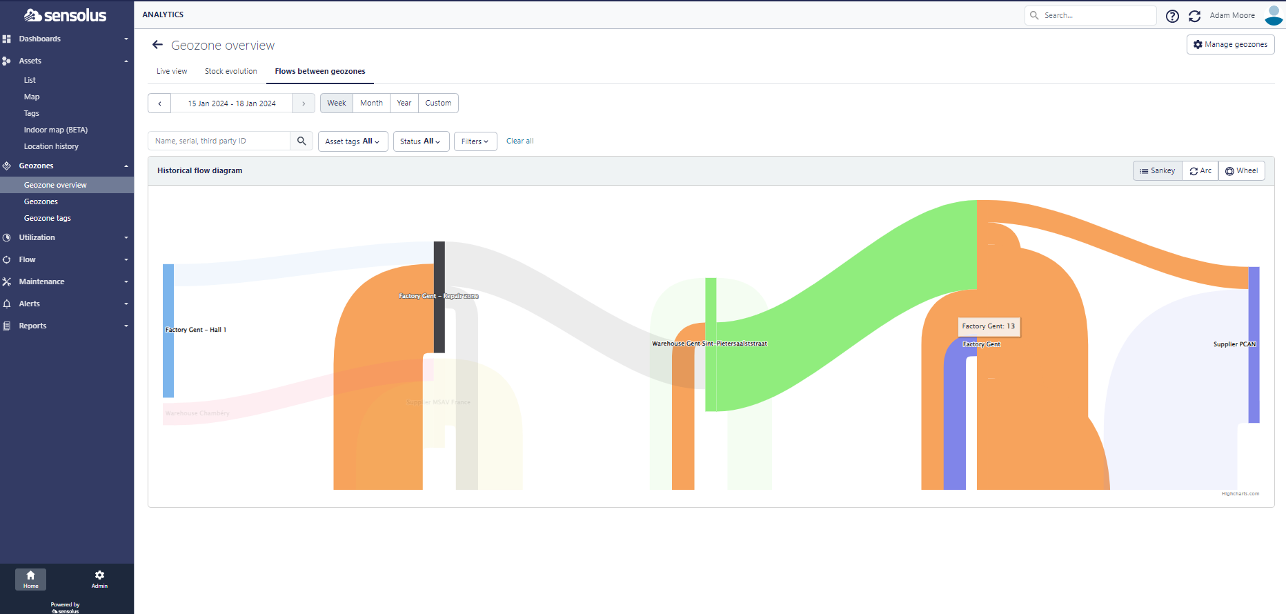
You can choose between 3 visualizations: a sankey flow diagram, arc diagram or wheel diagram.