Location history data dashboard
Explanation on the location history animated available as dashboard on the Sensolus platform
Go to![]() Home → Assets → Location history to
access the location history data dashboard.
Home → Assets → Location history to
access the location history data dashboard.
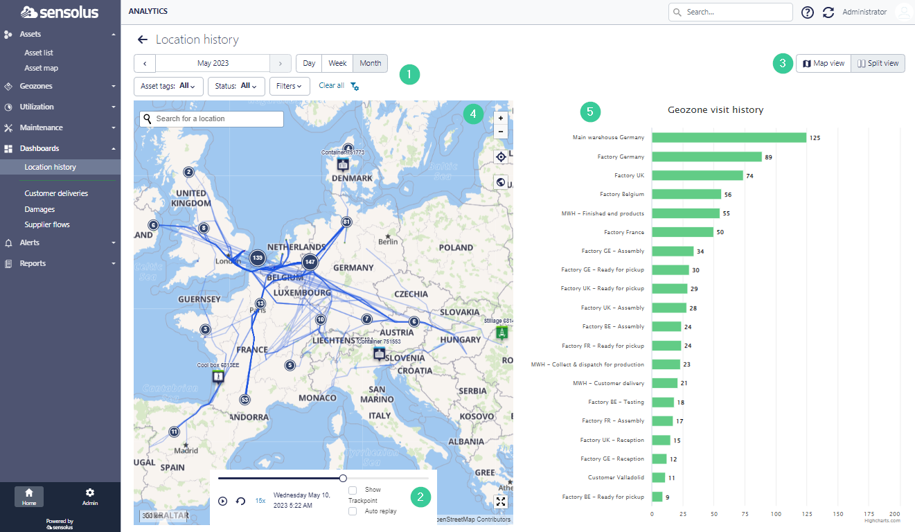
First, select the time period of which you want to see the geozone visits of your assets. Use the filter if you only want to see the history of a selection of your asset fleet.
Second, you can start the animation by clicking on the ![]() button. If you select the Show Trackpoint
feature you will see the lines of the travels of your asset (like in the figure above). If you
select Auto replay feature the animation will keep on playing (this can
be useful for showcase purposes).
button. If you select the Show Trackpoint
feature you will see the lines of the travels of your asset (like in the figure above). If you
select Auto replay feature the animation will keep on playing (this can
be useful for showcase purposes).
It is possible to show the history animation in  full map view or
in
full map view or
in  splitview (this is the default setting) or the heatmap. Just click
the button of your preference.
splitview (this is the default setting) or the heatmap. Just click
the button of your preference.
Under (5) you see the table with the names of the different geozones in your organization. For every geozone you see the evolution of the number of assets that are available in this geozone over time. The animation on the table is aligned with the animation on the map.